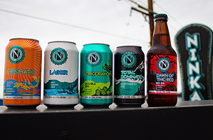
Ninkasi Brewing is so excited to launch a refreshed look for Spring 2022. Here’s an inside look at the refresh process with Ninkasi’s Senior Graphic Designer, Denise Lutz. Denise joined the Ninkasi marketing team almost three years ago and is originally from Eugene.
Why did Ninkasi want to refresh the packaging?
Denise Lutz: While it was time to give our packaging a fresh look, we also wanted to reinforce the Ninkasi brand as deeply rooted in the Pacific Northwest. We returned to the slogan on which we were founded: Perpetuate Better Living. Ninkasi is a celebration of the Pacific Northwest and the people who live here. It’s all about those experiences you have with each other, enjoying a pint while doing so. We wanted our packaging to reflect that.
Where did you find inspiration for the art and design?
DL: For me, it was all about layering meaning. Ninkasi has such a rich design history, and I wanted to carry some of it over into the refreshed designs. For example, the starburst is an adaptation of an early rendition of Total Domination’s packaging, and it was important to carry over some of that history from
In addition, I felt we had an opportunity to explore and experiment more with color. I was inspired to find colors that matched the vibes of our beers and tried to capture the energy our delicious beers have in every sip!

Ninkasi Brewing – Cornerstone Series
How does this new art align with Ninkasi’s goals?
DL: The art is a reflection of what matters most to Ninkasi: making great beer and realigning the brand with the amazing communities in the Pacific Northwest. It’s those experiences that draw you in, and we wanted our packaging to have the same effect.

Ninkasi Brewing – New Bottles
What was the process like?
DL: It wasn’t easy, but it was rewarding. Everyone (including the marketing and sales teams and management) trusted the creative process we went through, and because of that, we landed somewhere pretty awesome with cool new designs. During the process, we dove deep into our values and mission as an independent brewery and had many discussions as to how those values materialize in design.
Previously, our design aesthetic was a bit all over the place. While we had a design system, we didn’t have cohesion across our beers. This branding refresh was a realignment of our beers both through messaging and aesthetics.

Ninkasi Brewing – Wonderment Series
There’s clearly some cohesion and separation into series. Tell us more about that.
Yes! One exciting development of this refresh process was the separation of our beers into series. Through our innovation process, some of our beers naturally fall into different categories, and we wanted our messaging and design to reflect that.
Now, we have our cornerstone series: these are the beers you know and love, and their designs emulate how you experience them. Then we have our wonderment series: for these beers, it’s more about the journey than the destination.
Finally, we have our Legends of Ninkasi series. This is creativity at its fullest, a deep dive into creating a whole world: the Ninkasi Comic Universe.

Legends of Ninkasi Series
What do you hope customers experience when they enjoy a Ninkasi beer?
DL: We’re unapologetically ourselves at Ninkasi! You see it in the beer, in our community involvement, and now through our packaging. I hope customers know how much we care about canning and bottling the PNW experience!
Cheers! Look for Ninkasi’s refreshed look on shelves near you.